Understanding the product and buyer
EasyBook is inventory software. But shop owners don't wake up wanting software,they wake up worried about missing stock and lost sales. That gap became the starting point.
- Audience: small business owners still using notebooks or Excel
- Core value: real-time visibility into stock and sales
- Goal: make the problem feel real before naming the fix

One reusable layout, many messages
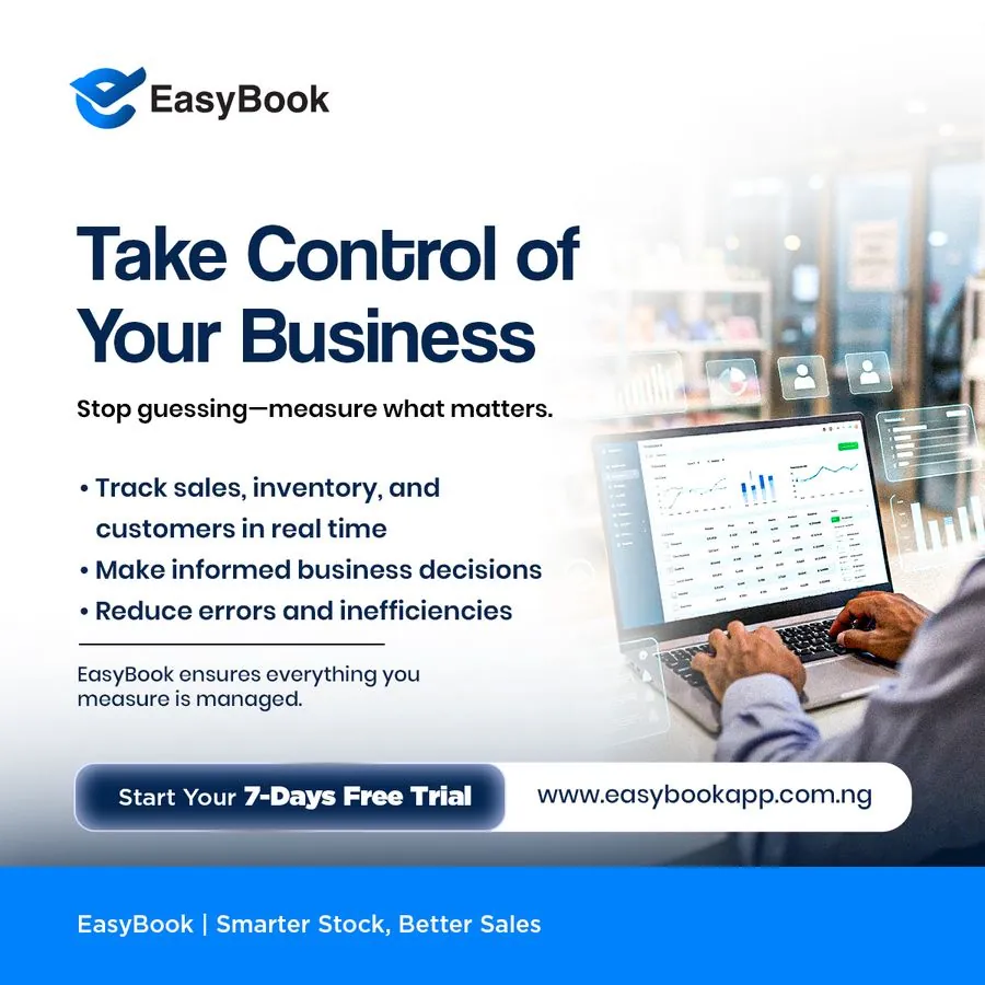
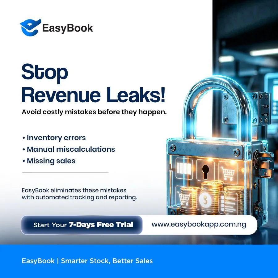
Rather than a new design each time, I built one template: bold headline, short subline, 3 quick bullets, product visual on the right. Only the message changes.
- Consistent logo placement and blue brand color
- Same footer bar and CTA button on every ad
- Fast to produce, easy to A/B test headlines
Leading with a felt problem
Each ad begins with a real concern shop owners already face: misjudging inventory, running out of stock, or losing a sale. The product is then positioned as the solution to that problem, not as a list of features.
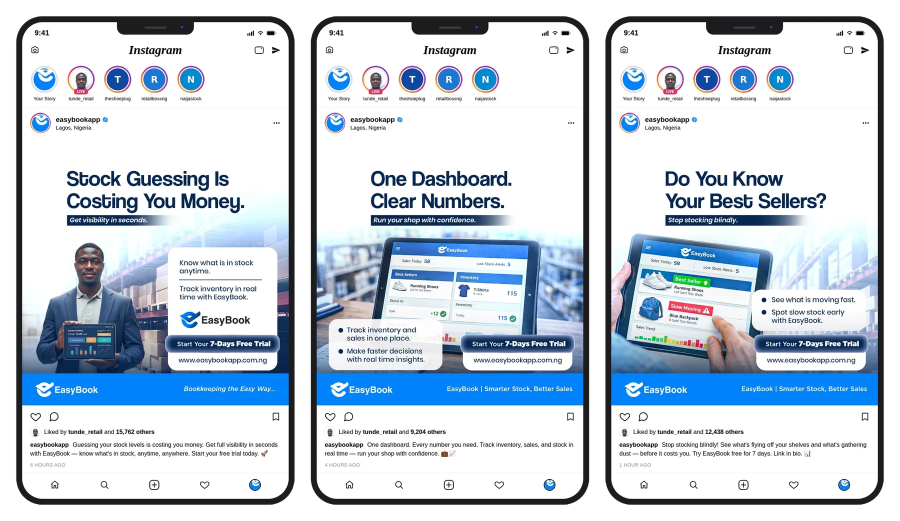
- "Stock Guessing Is Costing You Money"
- "Out of Stock Equals Lost Sales"
- "Real devices, not just UI screens"

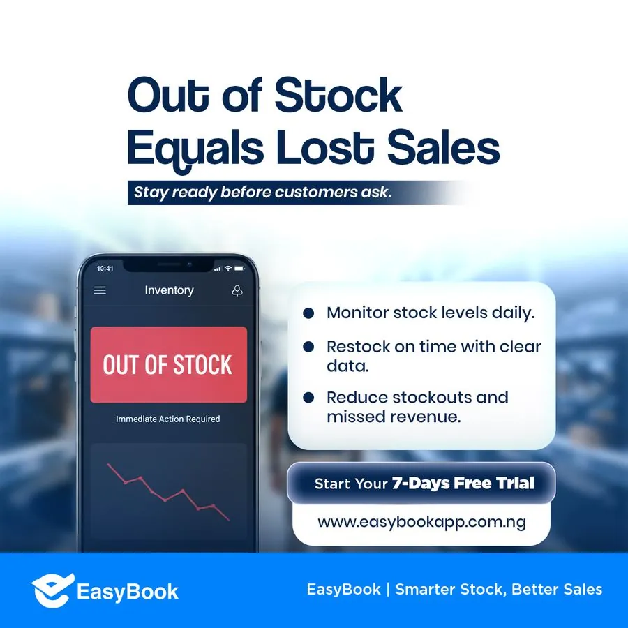

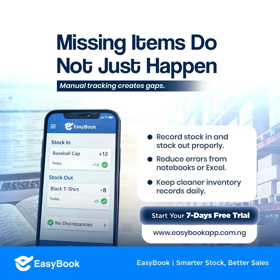
Making the product feel real
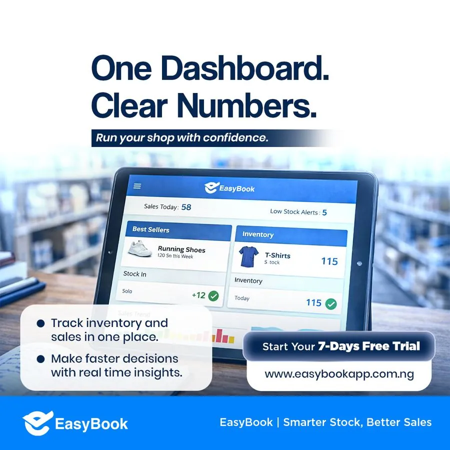
The app screens inside each ad show plausible numbers,"Sales Today: 58," "120 Sold This Week",so it reads like a real dashboard, not a mockup.
- Realistic sample data, not placeholder text
- Everyday products (shoes, backpacks, t-shirts) buyers relate to
- Green checkmarks and alerts borrowed from familiar app patterns
One consistent close, every time
Every ad ends the same way: same footer bar, same free-trial button, same URL. The message changes; the path to action never does.
- "Start Your 7-Days Free Trial" on every single ad
- Website URL always visible, never hidden in a caption
- Tagline locked: "EasyBook | Smarter Stock, Better Sales"